Element is the go-to provider of facilities management in Bristol, going above and beyond to ensure excellent customer service, every time.
Background:
Element is a full-service building management specialist, maintaining properties across Bristol and the surrounding area. However, despite a plethora of happy customers and a team of loyal staff, they had no visual identity. This made visibility of the business—both physically and within the competitive marketplace—non-existent, hindering their plans for growth.
Element is a full-service building management specialist, maintaining properties across Bristol and the surrounding area. However, despite a plethora of happy customers and a team of loyal staff, they had no visual identity. This made visibility of the business—both physically and within the competitive marketplace—non-existent, hindering their plans for growth.
The solution:
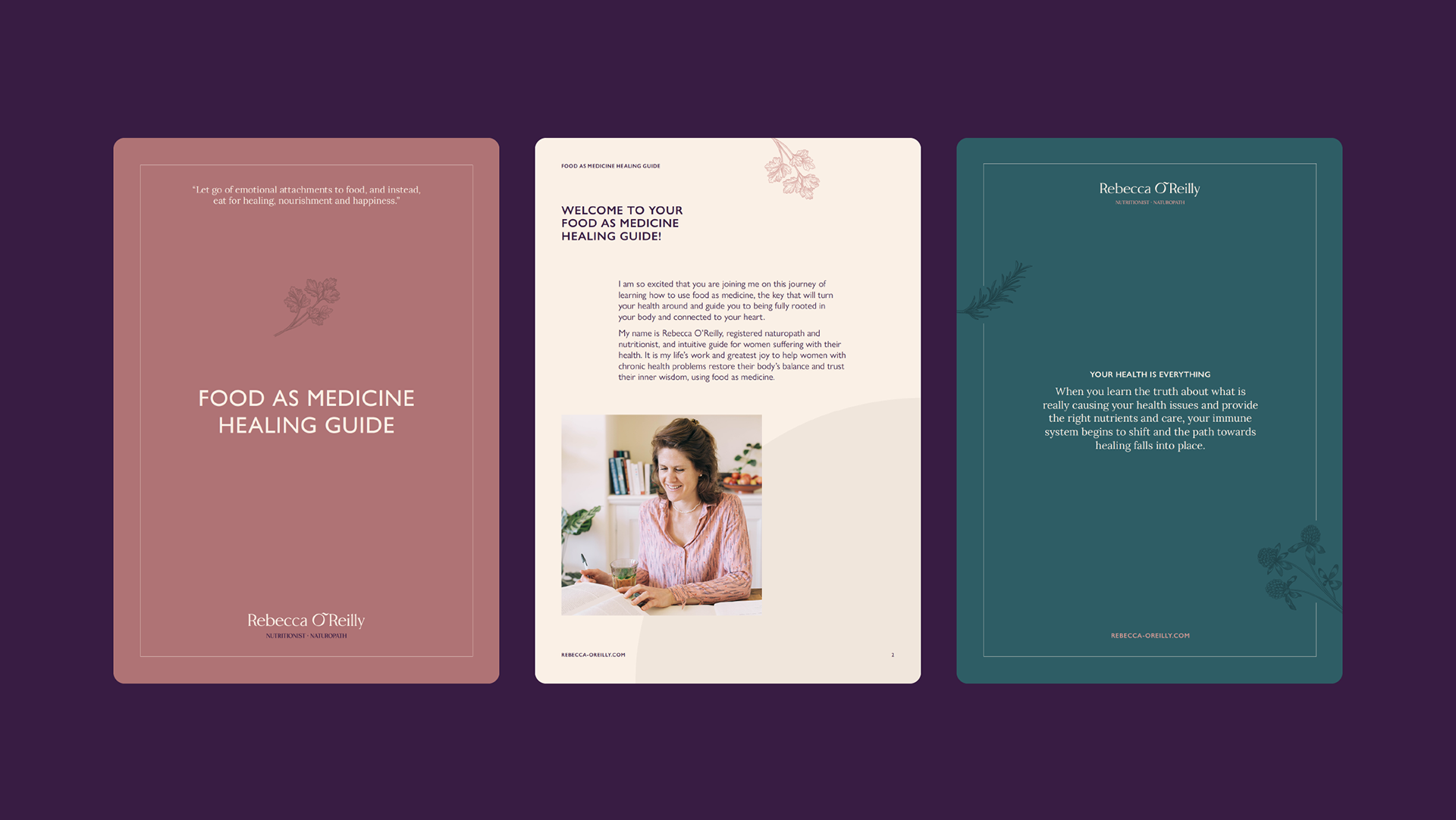
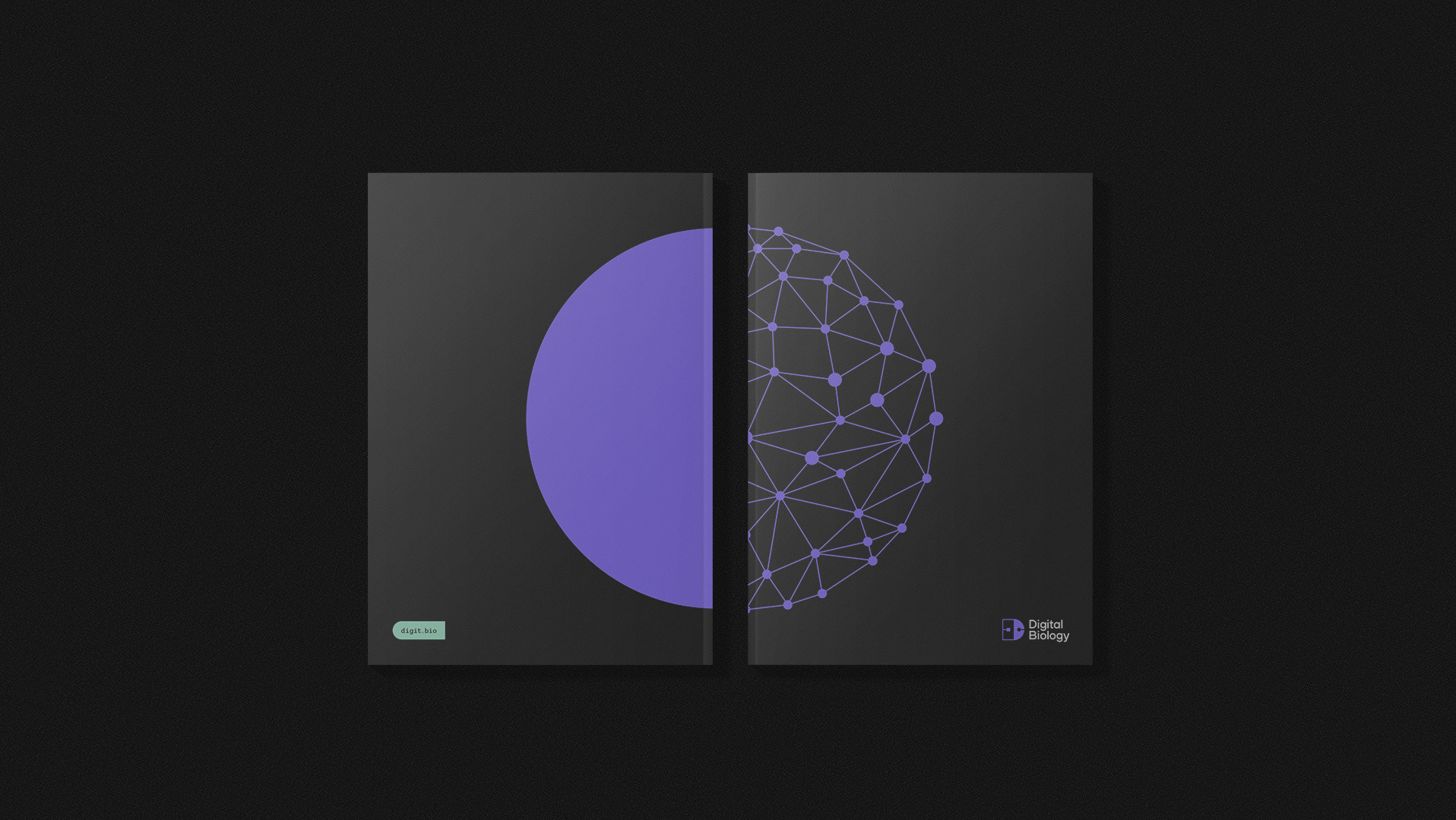
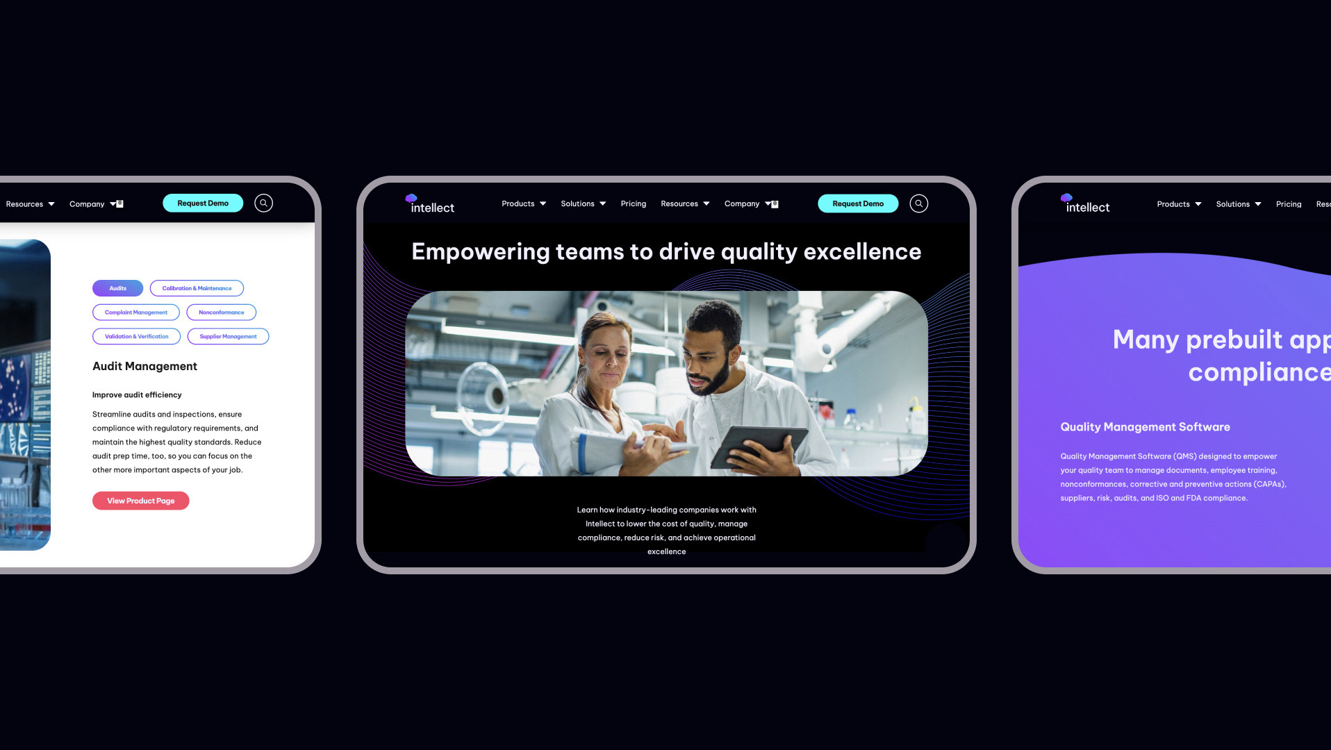
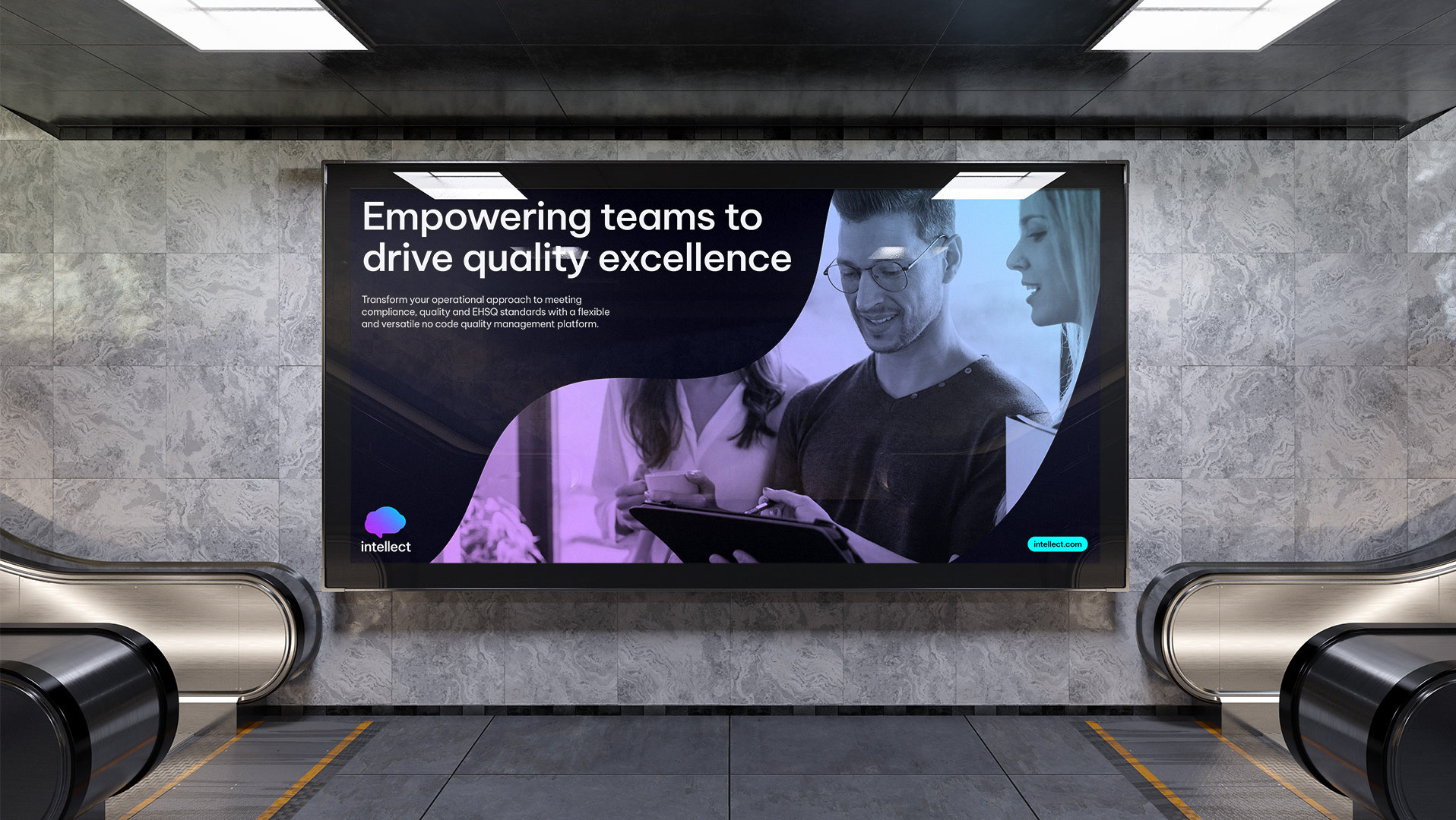
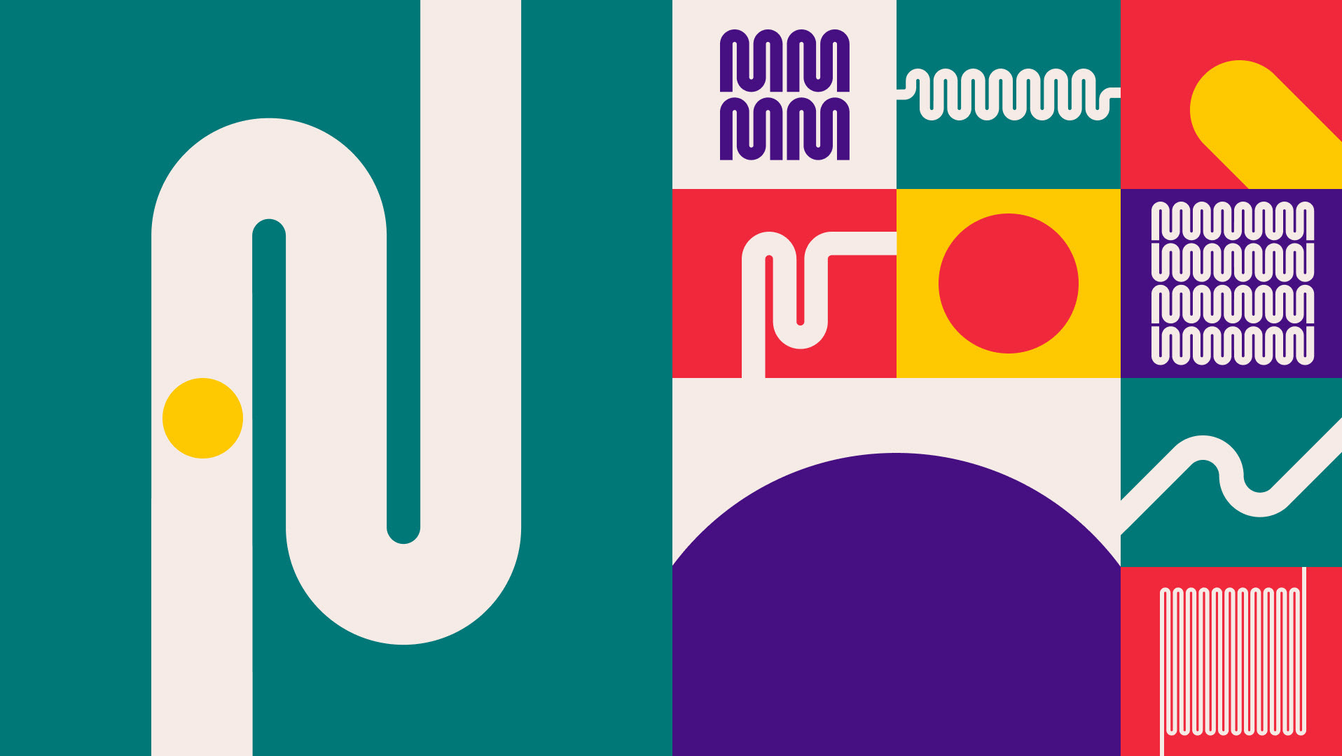
Myself, along with my business partner Dan, worked with the team to create a functional yet bold visual identity, one that unified their experience and expertise within the sector. Instead of following the clichéd use of hard hats and hi-vis jackets, typical of the industry, we created a suite of illustrations based on their specialist areas. The tagline of ‘Buildings, managed’ was borne out of consistently high customer satisfaction levels, Element’s commitment to delivering a first-class service and their extensive expertise.
Myself, along with my business partner Dan, worked with the team to create a functional yet bold visual identity, one that unified their experience and expertise within the sector. Instead of following the clichéd use of hard hats and hi-vis jackets, typical of the industry, we created a suite of illustrations based on their specialist areas. The tagline of ‘Buildings, managed’ was borne out of consistently high customer satisfaction levels, Element’s commitment to delivering a first-class service and their extensive expertise.
What was delivered:
Brand strategy
Naming
Visual identity
Illustration
Animation
Website
Brand strategy
Naming
Visual identity
Illustration
Animation
Website
Who I partnered with:
Dan Srokosz – Creative direction and design
Georgia Green – Copywriting
Amelia Cullern – Animation
Cityscape photography by Martyna Bober
Dan Srokosz – Creative direction and design
Georgia Green – Copywriting
Amelia Cullern – Animation
Cityscape photography by Martyna Bober
“Whilst working with Mark and Dan on a re-branding project, I was impressed by their attention to detail and willingness to understand our business. They helped us to better define our own identity and the things that mattered to us; points which were later captured in their development of the brand. The end result captured the essence of our business, keeping relevant to the industry but setting us apart from the competition.”
—Andrew Kidd

