
Coming out of stealth with a stellar seed fundraise, Miga Health approached Wunderdogs, where I work as a senior designer, to help them define their presence.
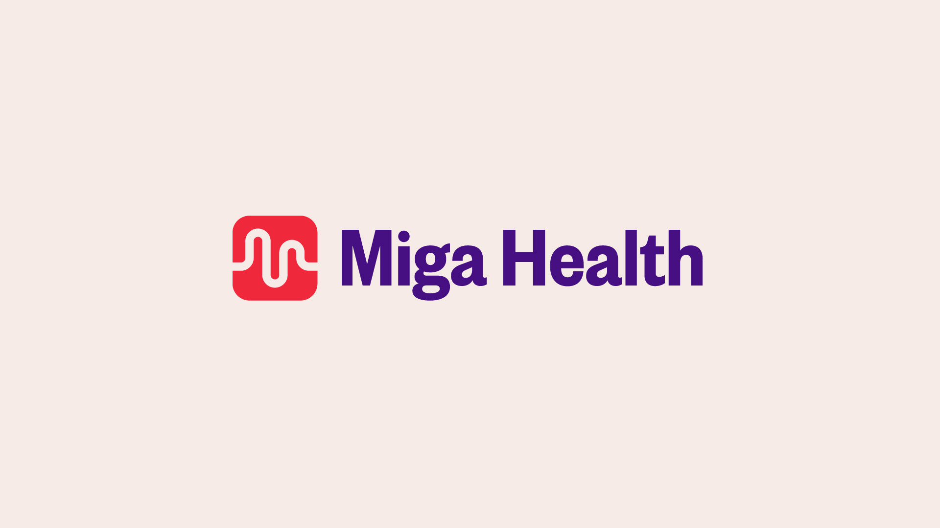
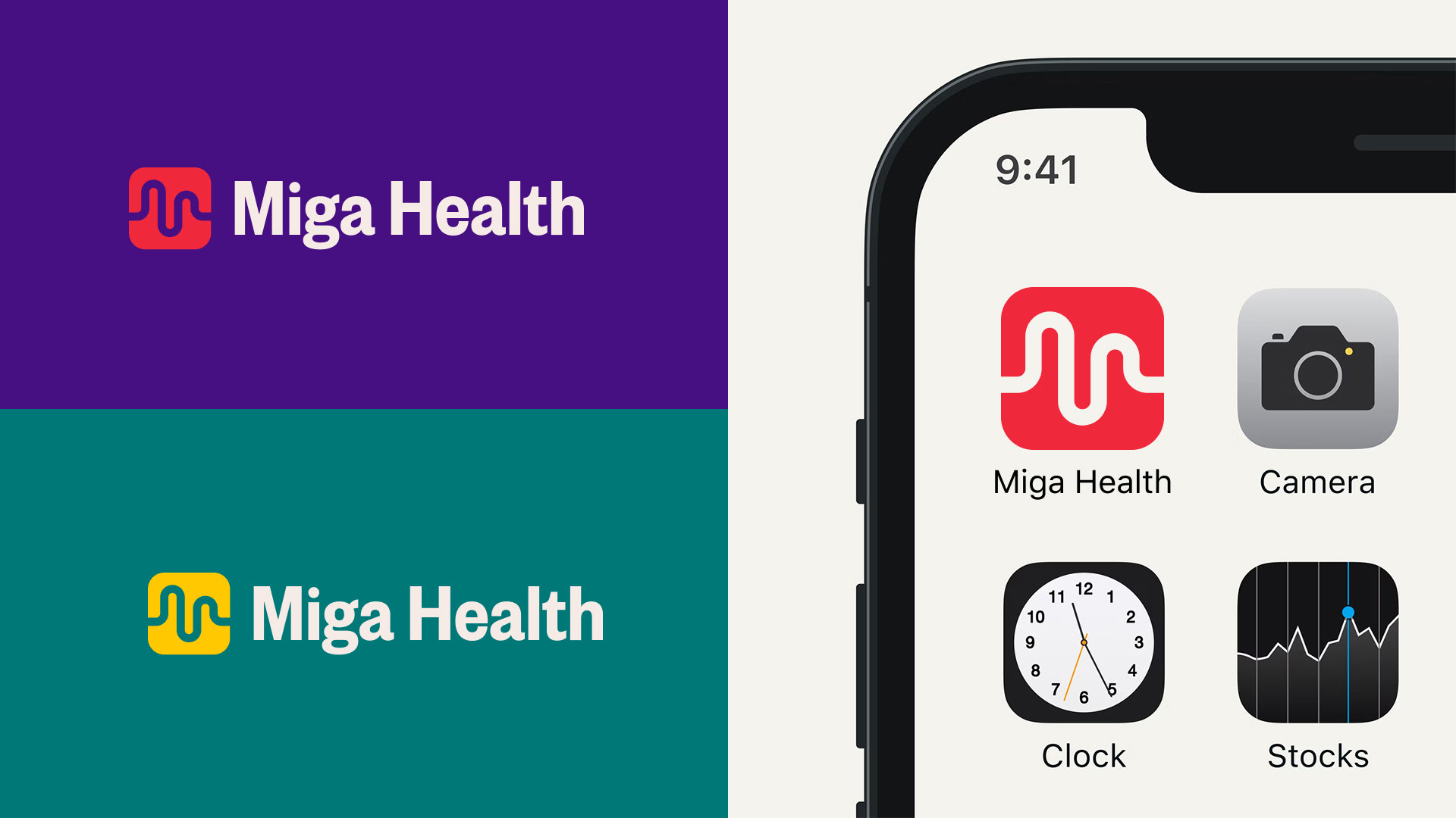
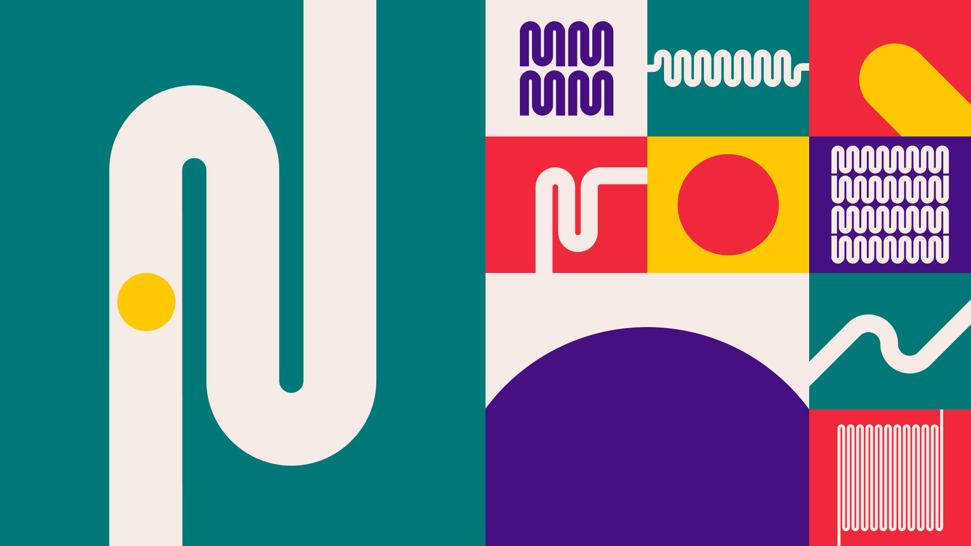
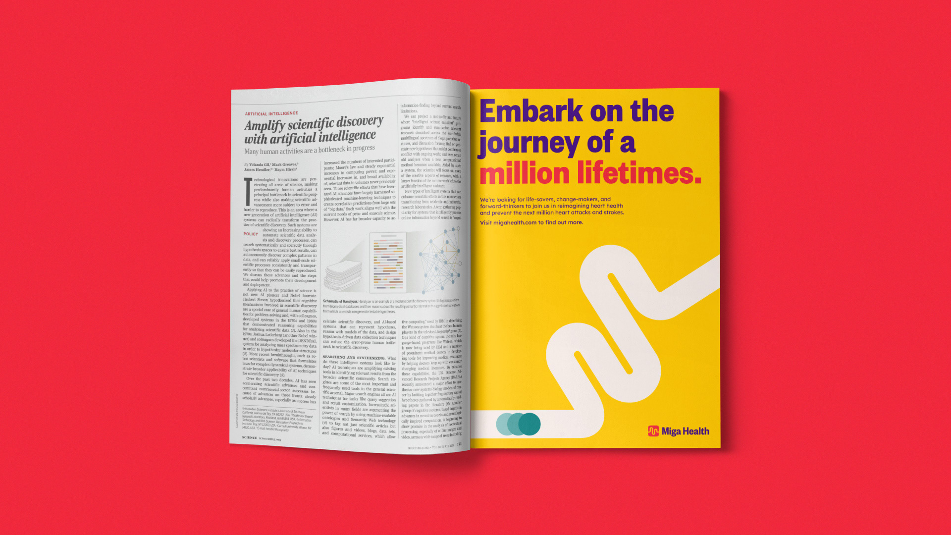
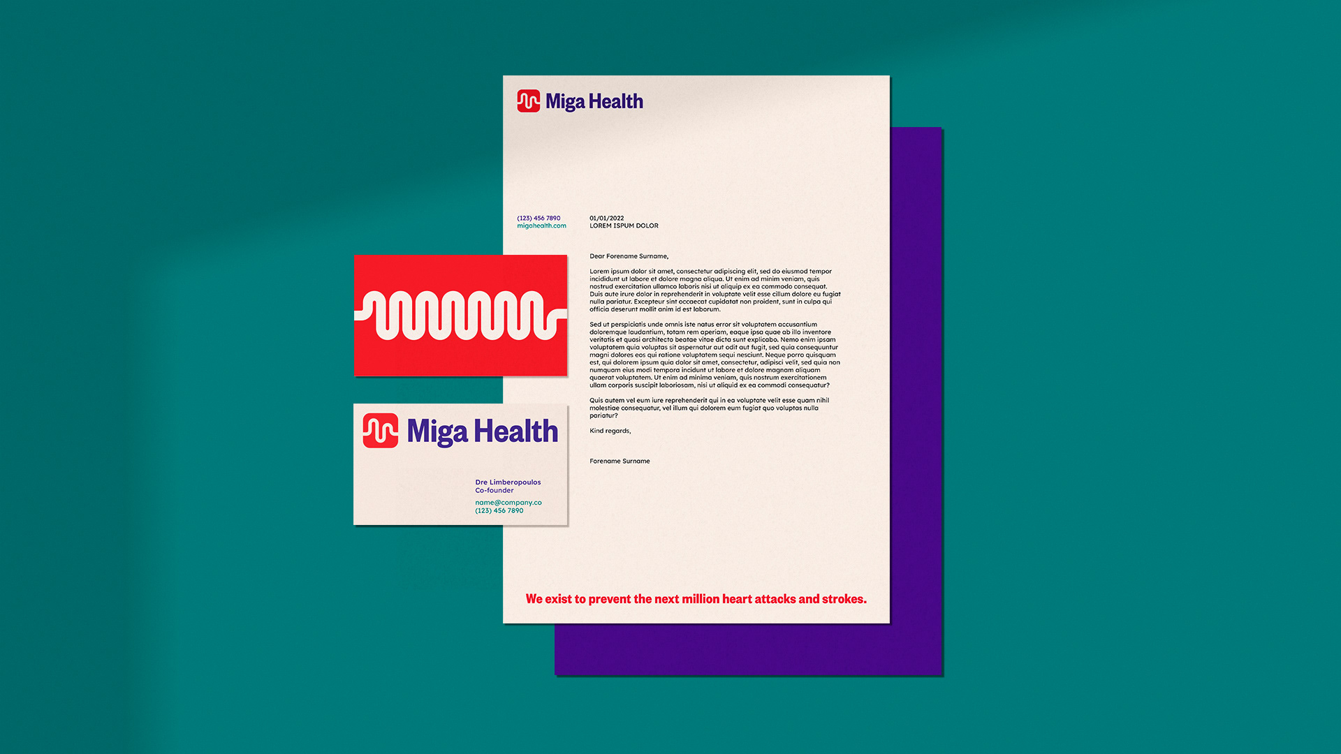
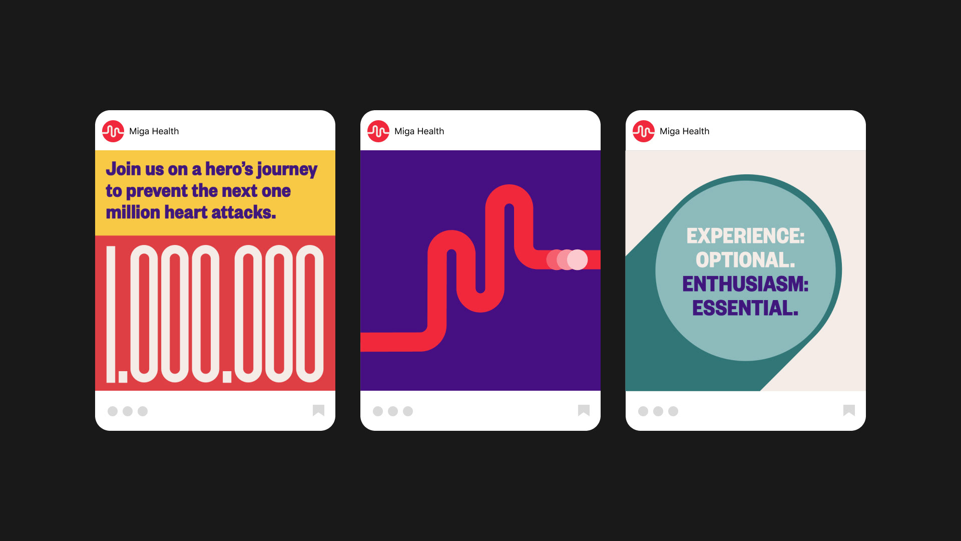
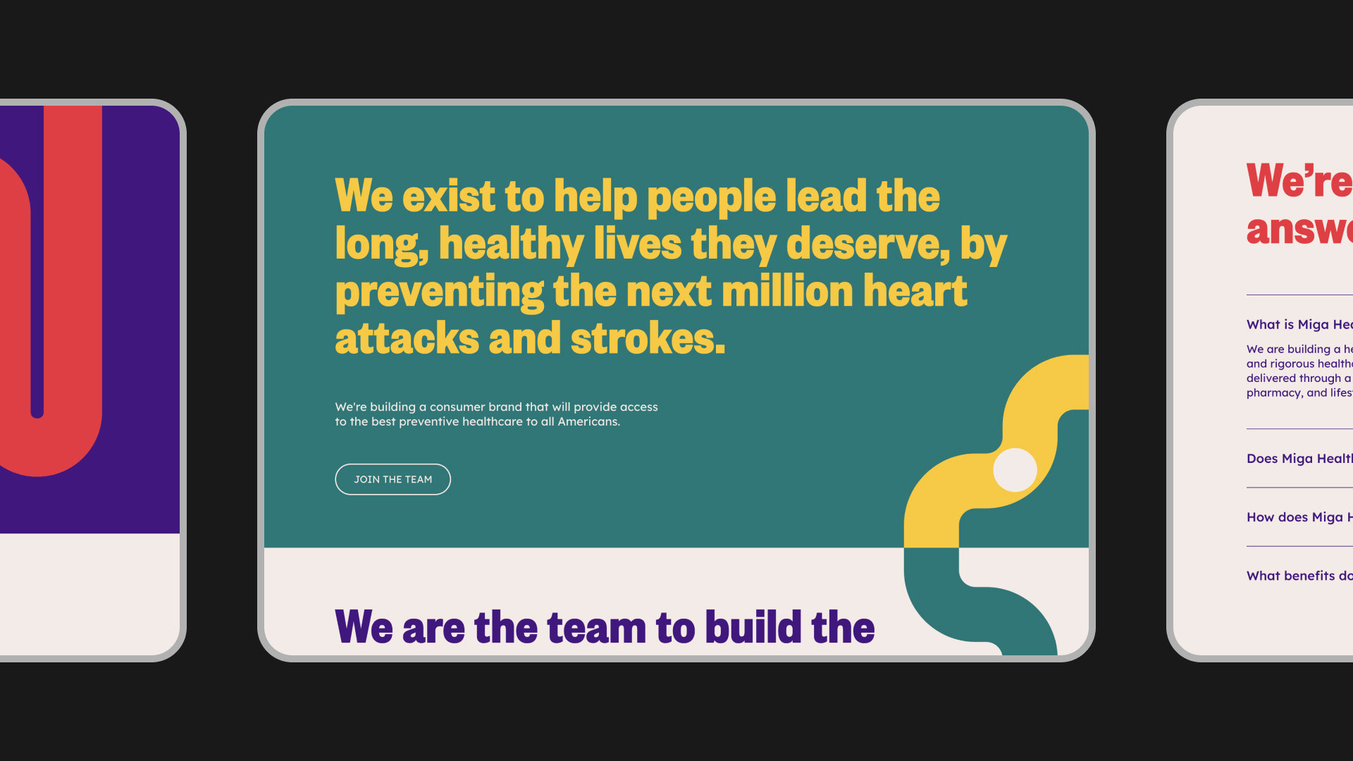
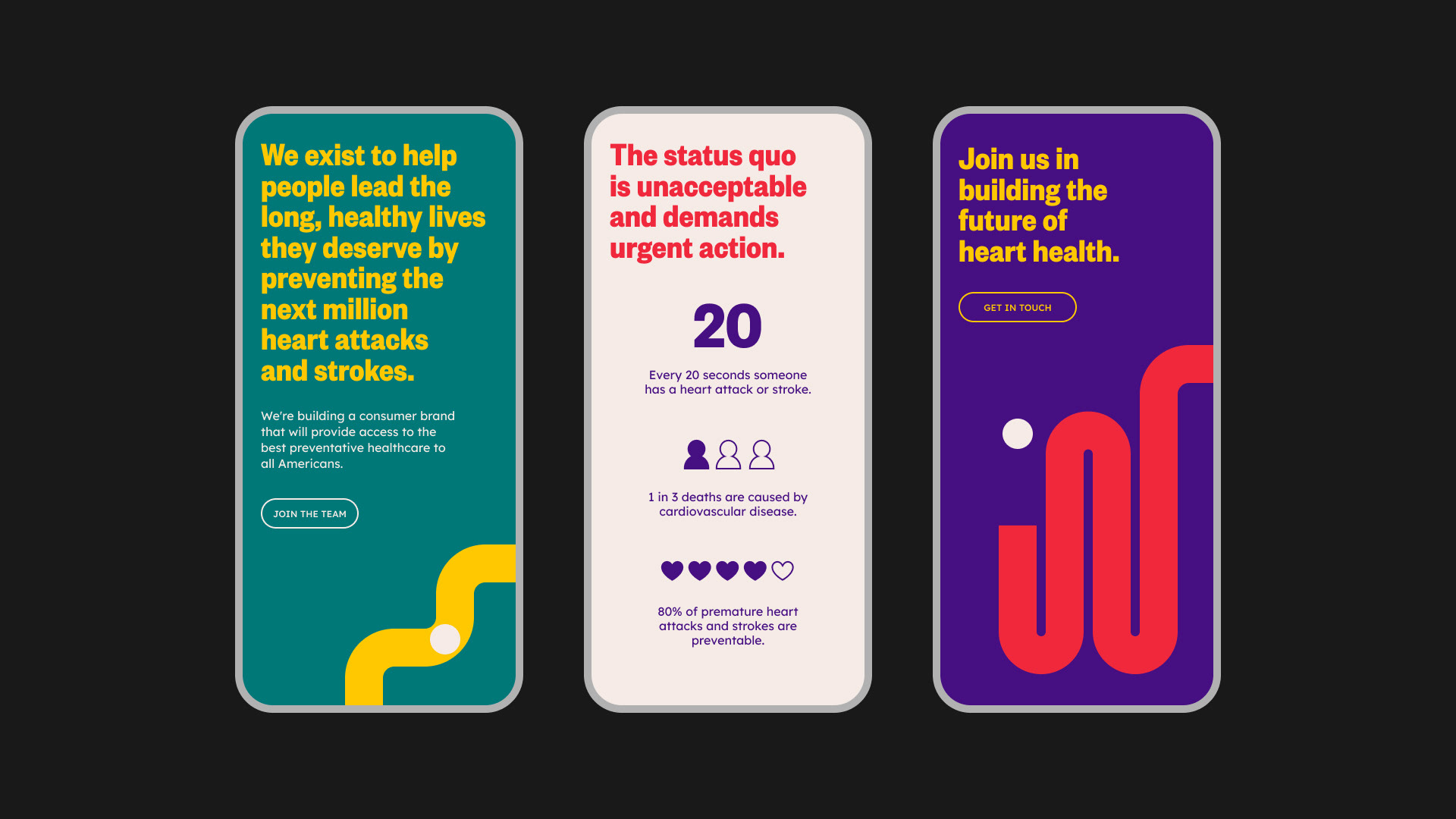
Proud to do things differently, Miga Health challenges expectations to empower consumers to address their heart health. The new visual identity is led by a bold logomark that captures three core elements of the brand: the M of Miga; the reading shown on an ECG monitor; and a winding road depicting not only the journey of growth for the brand, but also the path towards better heart health for its customers.
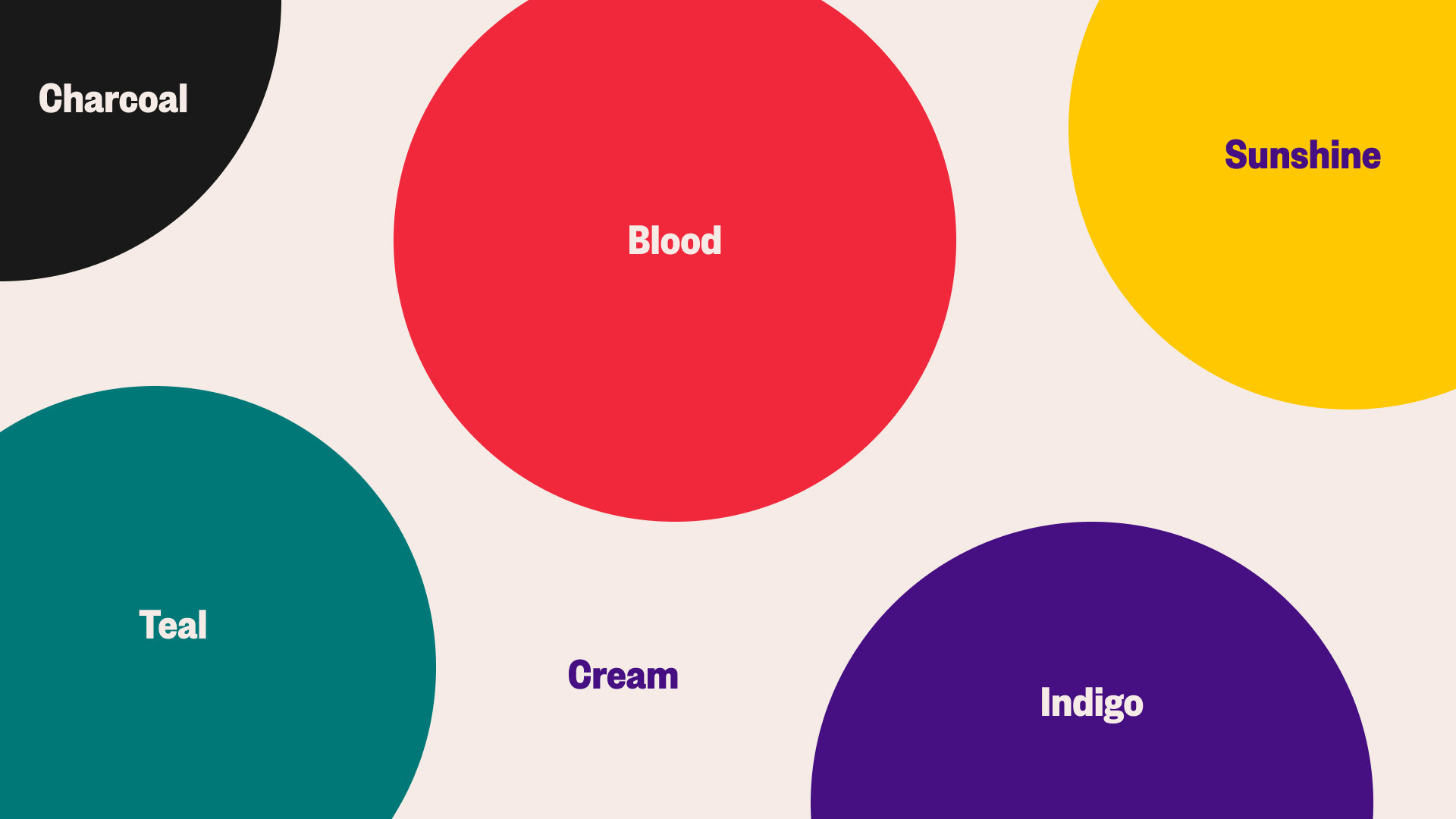
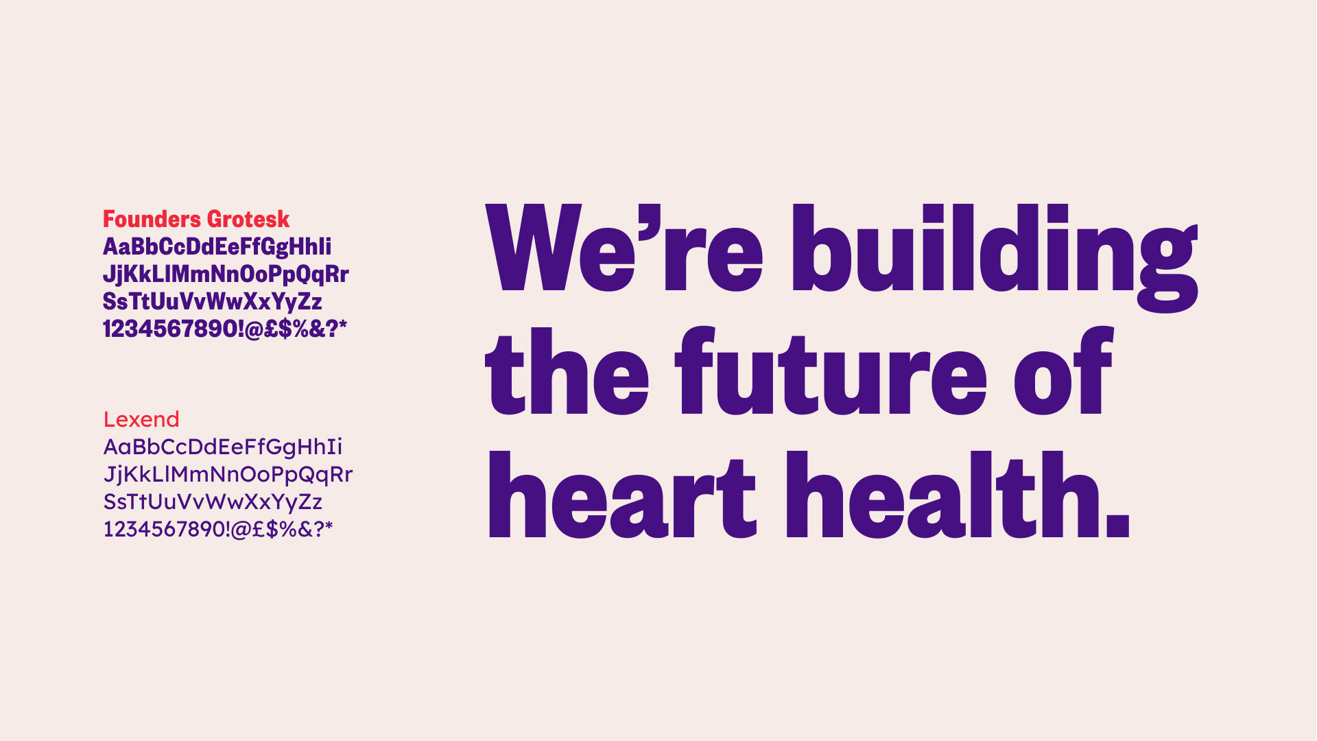
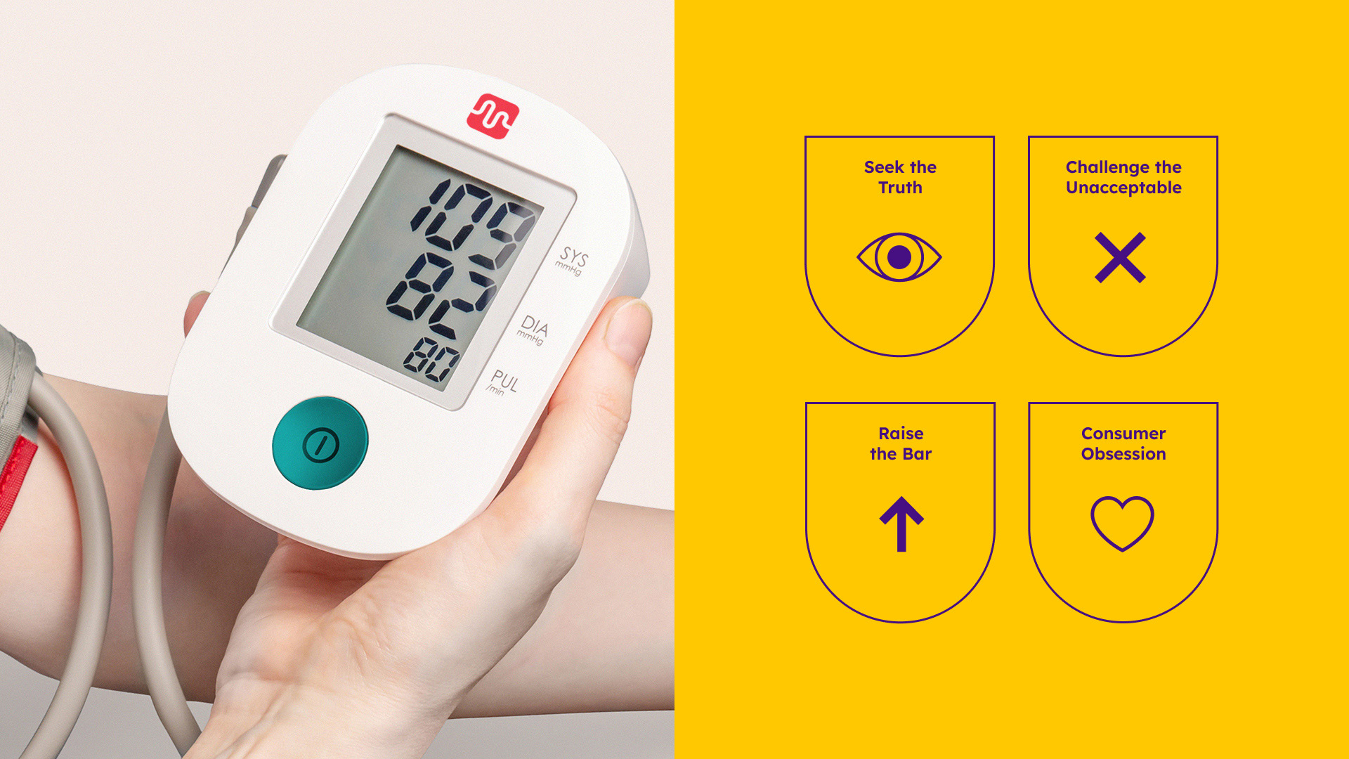
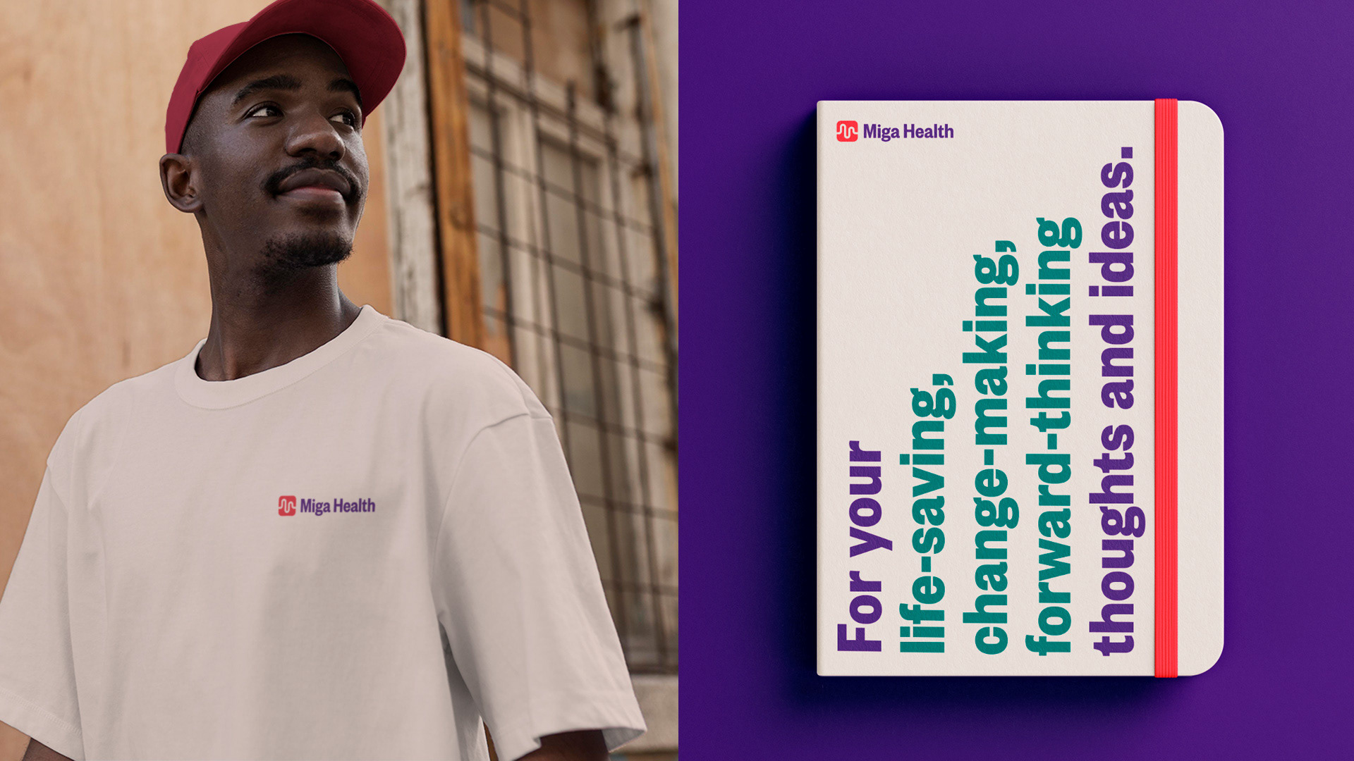
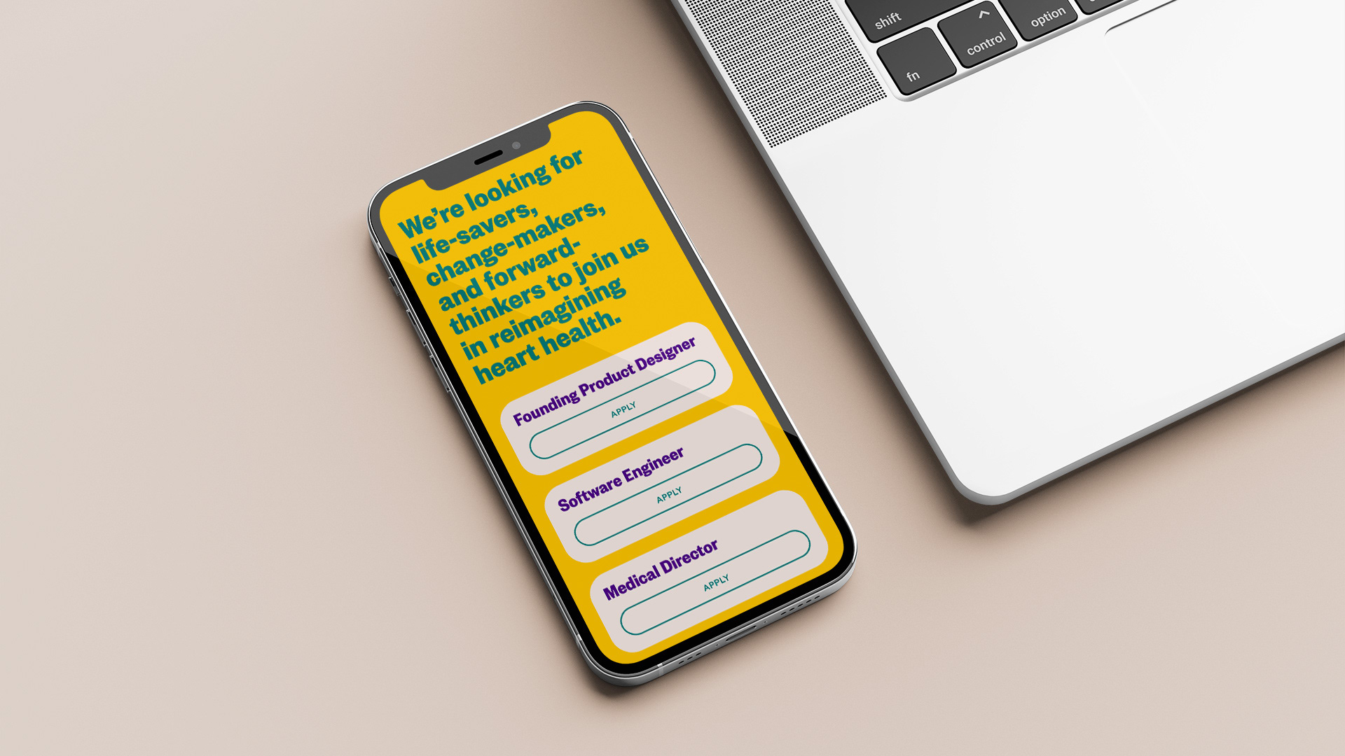
This acted as my foundation, driving my approach to create a flexible identity that reflected the brand's ambitions to take a stand—executed through uplifting colours and impactful graphics that create a sense of optimism in what could be a difficult time for its customers.
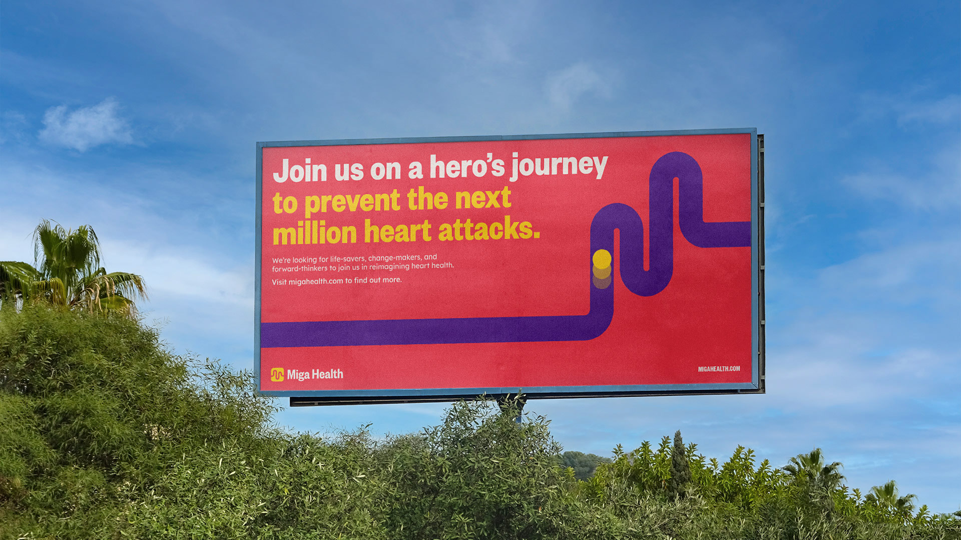

Since the completion of the branding exercise, the Miga Health team announced the raise of $12m in their seed round, complemented with a new media campaign to officially launch the brand into the world.